We presented our research questions in class. I think it went relatively well, though presenting with a time limit and with a mask on was a LOT different than the artist talk I gave over Zoom earlier in the day. Definitely a noticeable contrast between the two. At any rate, we also had time to talk with others, think about potential collaborations and the like, which was useful. Upon talking through my idea with Alfie a bit more, she suggested that even I was to make something computer generated or machine based, chances are I am still going to be more interested or end up doing it the “dumb” way. Dumb here is definitely not being used pejoratively, just to clarify. Honestly, she is totally correct: I really would rather do it by hand, even with all the extra work that might entail.
When I expressed this to Ryan and Annet, as well as my concerns about feeling, quite frankly, overwhelmed by the thought/task of learning enough programming, etc., to do what I was seeking to do, they were (amazingly) understanding. Annet even proposed or talked about how using my own body as the machine instead of a computer, which is something I hadn’t considered. Could I push this idea, and maybe my own limits, and see what was generated? Pretty intriguing!
I did a test run of an idea over the past weekend, and definitely learned a few things. First, I will describe the set up: fill a page up with the same letter, printed repeatedly. I chose the letter E because it is the most commonly used letter in typesetting, and thus felt like a natural first choice.

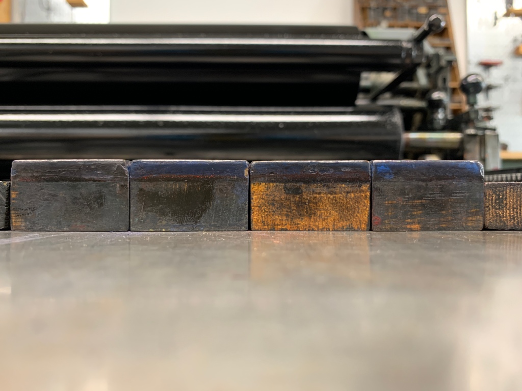
Granted, wood type is a bit different than lead type, but the point remains that E is a very commonly used letter. So, I examined what sizes I had available to me in the letterpress studio, looking for something that was roughly a square size, thinking this would help to maximize the area on the sheet, as well as making my math easier as I moved things around. I settled on a “10-60″, which in Globe Press jargon means it is 10 line, or a bit over 1.5” tall. The 60 is actually a catalog number from when they ordered the type, but it serves as a guide to relative width. For instance, a “10-51” would be narrower than “10-60,” and “10-71” would be even wider than “10-60” is.
As is the case with these things, there was a limited number of specimens available. While I originally intended on printed just 1 letter E, I decided to use as many as I could find, in this case 4. This proved to be smarter, as the process took a lot longer than I could have anticipated.

Upon locking up the type, I did a few proofs to get it positioned in the way I wanted, again, to maximize the number of characters I could print on a sheet. My sheet size was 12.5″ wide, and so I was able to get 8 Es per line. The process from here was mostly the same:
1. Print 4 Es
2. Move the Es over and print another 4
3. Move the 4 Es down, print
4. Move the 4 Es over, print
5. Repeat, repeat, repeat.


I had about 4 hours to work on this over the weekend, as that is what my schedule allowed for. I thought it would be no problem to fill a whole sheet (12.5″ x 19″) with Es. I was definitely wrong! In the end I only got 4 lines done. But, when you do the math, that is 32 per sheet, and if I did about 12-15 good sheets, that is still 384 Es, which is nothing to scoff at.
Now, I probably could have been a bit more productive had I taken more care when selecting the type. It wasn’t until I was moving it around that I noticed some problems with it that I would end up having to troubleshoot every time I moved the line around. Mainly, this letters weren’t square! Thus, when I tried to lock them up on press, they naturally wanted to spring upward and form a small arch, which can lead to disaster while printing, damaging the type, the press, or both. I eventually figured out a solution that worked, but still took time to reset it each time I moved the line.
It wouldn’t be printing without some troubleshooting and having ink all over your hands (or at least in my opinion). While it wasn’t as productive as I thought, it was still a valuable learning experience, and I can take what I learned and apply it moving forward, both in this class and future printing endeavors. As for next steps…maybe it is scanning these and beginning to figure out a workflow to cut them out? Or is it fully fill the sheet and see what that looks like. Do we even recognize it as an E anymore? What if the character was narrower, or wider? What if it was a word instead of a single letter?

